Adelaide Interplay Therapy, which also goes under the name of Adelaide Hills Interplay Therapy, was a small startup business that needed a both a digital and analog presence. It focuses on helping children and families through play therapy.
Working from the ground up, we collaborated and co-designed throughout the project. The brand needed to be authentic and warm, leaning into natural tones. It needed to be playful but remain professional and legitimate.
I stayed away from too many hard or straight lines, and leaned into soft curves and subtle gradients. The point was to cancel out a lot of noise and allow for a safe and reassuring place to engage with the information, since most of the target audience would be anxious and frustrated parents (based on the personas).
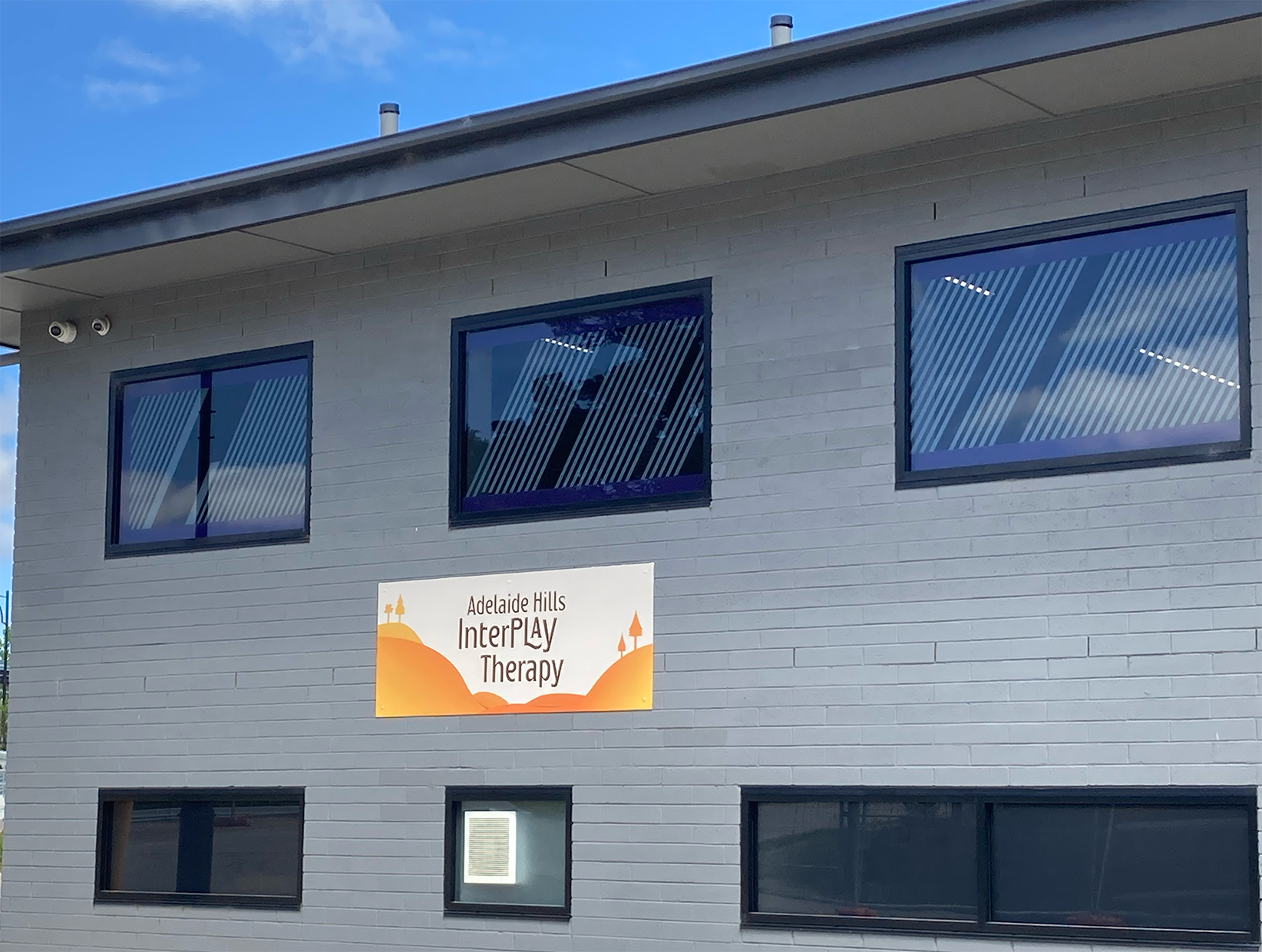
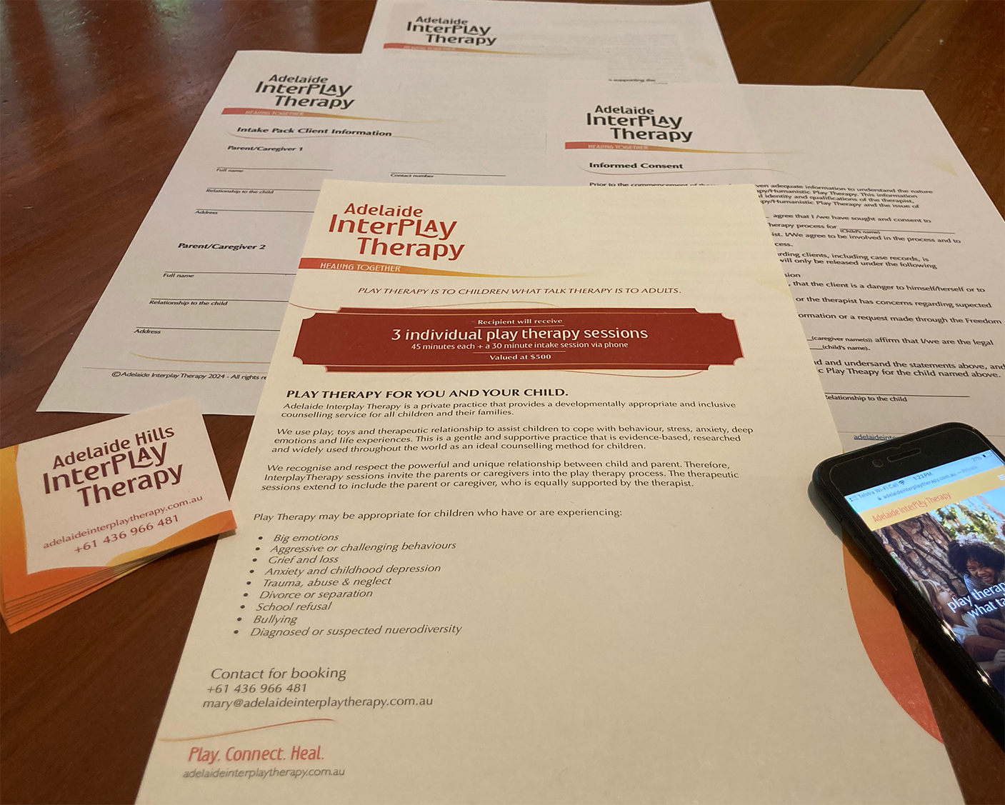
Included in the brand design, apart from the usual logo and colour palette, was legal and information documentation templates, invoice template, outdoor signs, business cards, marketing (flyers) and certificates, liaising directly with the printer on the client's behalf. I included variations in graphic assets for the client to use in social media (ie hero images, appropriately sized logos, favicons, and app button).
The website is a single page longform website. The user needed to be able to access information quickly and easily, avoiding anxiety from having to move off page for anything. It's an informative journey ending in a contact form. Navigation is easily accessible, moving the user to specific points on the page.
I built the website to be responsive, accounting for large HD screens all the way down to the iPhone SE.
In this project, I used Figma, Photoshop, Illustrator, InDesign, photography, copywriting, and learned Webflow in order to build the site.
